Brand Archetypes and Experience Design
In design generally, psychology plays a major role, two fields in design that heavily leverages on it are User Experience and an element of brand strategy called Brand Archetypes. Knowledge of these two fields is what helps brand/project managers excel at their job and what — always — causes the rift between them and brand designers.
What are they and how do they leverage psychology?
User Experience design is user experience design (through whatever medium). It is the steps and decisions taken to tailor the relationship between an interface and a user. The interface being anything a user can relate with, ranging from cars, door knobs, to even shower heads.
Brand Archetypes on the other hand, are a way to anchor your brand against something iconic — something already embedded within the conscious and subconscious of humanity. In the minds of both the brand owner and the public, aligning with a brand archetype makes a brand easier to identify.
These are some examples of brand archetypes and some brands and their archetypes:
Brand Archetypes are what determines what your brand’s personality is, it’s tone of voice, visual design language and a host of others, it can be likened to a spark that comes before a fire during ignition.
First, to correct some wrong notions, UX design is not only for interfaces, user experience design can be carried out for anything humans (or even animals) interact with, from events, apps, spaces and even physical products.
Use cases
A couple of examples of situations where a brand’s archetype and experience design comes into play are:
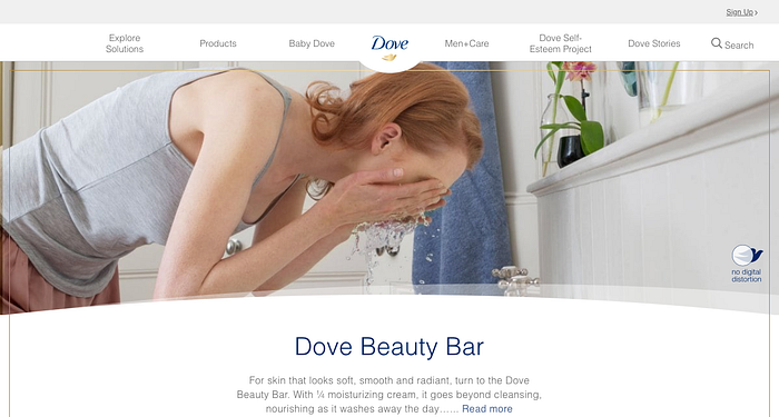
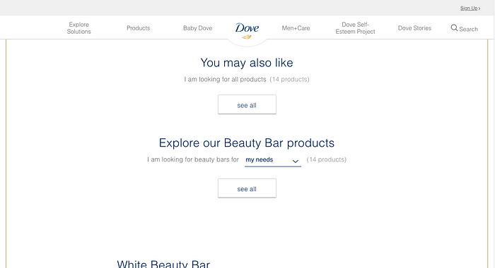
- Dove’s way of incorporating their brand’s personality into their website and product design. They majorly use the Innocent brand archetype and it is very obvious in their visual design, tone of voice and general flow for their website, also in the design for their product. the entire thing is designed to make you feel that Dove cares and that Dove only wants the best for you and your skin.

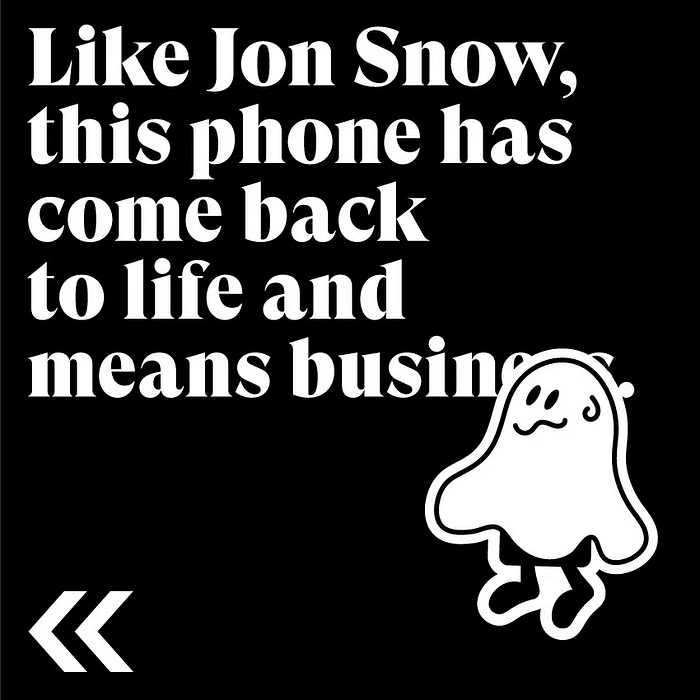
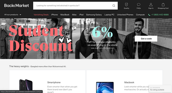
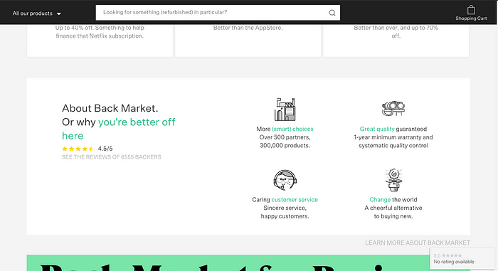
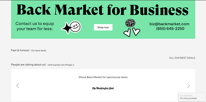
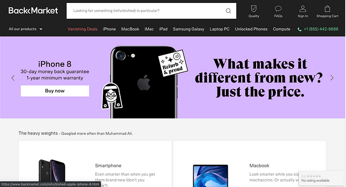
- Another example is Backmarket, the bold copy and design influenced by strong user experience design and obviously an even stronger dependence on the brand Archetype.
The copy and visual design is influenced by the Rebel brand archetype, their typography and colour choices follow this archetype.
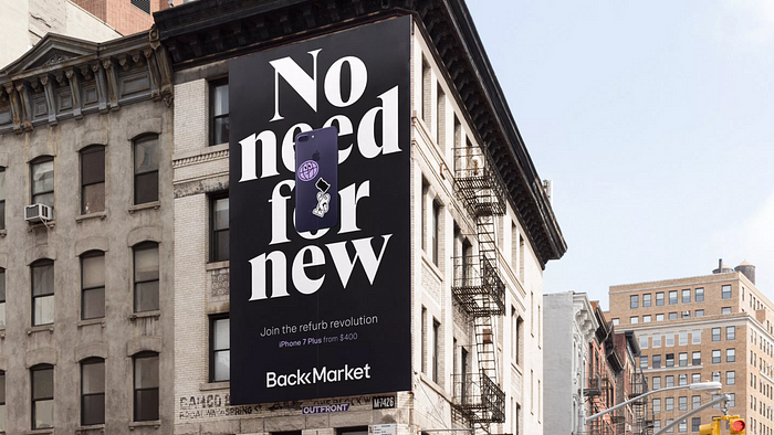
A closer glance through the Backmarket website would let you have an idea who their target audience is, and how they have done proper UX design and communicate with the right Archetype to them.
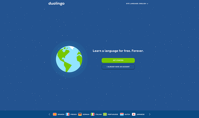
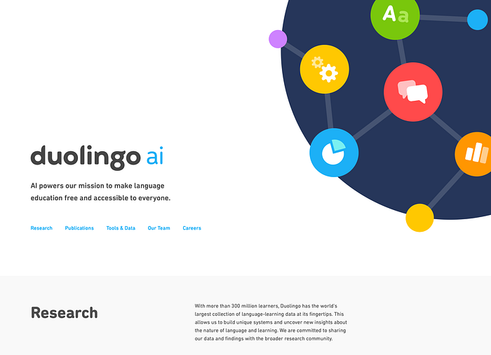
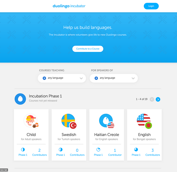
- Duoliongo, an awesome product that’s strong on branding and UX is another very great example of this. While aiming to make language learning easy and accessible they have chosen to use a fun and cool approach; this approach is backed up by the archetype they chose to go with (which in my opinion is majorly the explorer). Across various products and medium the brand and experience isn’t detached and thus they are able to communicate seamlessly. The tone is also one thing to take note of.
Simply put, the User Experience of a product or service can be likened to the background work, while the Brand Archetype deals with what channels they use in this communication and what design and copywriting choices they take in meeting this goal. The situation where Brand/Project managers, Copywriters and Designers always have issues arise when information about the former or latter are muddy and not concise, where the brand manager is trying to sell a product to a specific niche and the designer and copywriter are not clear on how it should look and work or how it should speak to the audience.
- Finally, Apple. I can’t stress how much I love the uniformity in this brand enough. Not much needs to be said about Apple, its show and tell.

Peep the similarity between the iOS control center and Siri Remote. Down to the iconography and button arrangement it’s ‘One Brand’. The Apple TV button against the Apple TV app Icon. Makes one wonder if they had designers and engineers from different divisions in one room(that’s a crowd). Now have a look at the TV app icon in the third image used in iOS and tvOS from December 2016 to March 2019 against the Home/Apple TV button on the remote. Now that’s a brand that loves it users (and money).
Conclusion
In whatever product or service an entity might decide to offer users, there should be a meeting point between these two at the core of any organization. You can’t have users feeling disconnected when interacting with product and organizations, it throws the entire brand off balance. That’s why Apple has ecosystems, they have successfully tailored similar experiences across a range of products. The simplicity you feel while holding an iPhone is the same you feel while holding an Apple TV Remote. Imagine having to interface with another Apple device and it feels different from the rest? the experience feels truncated and you do not see the brand as with the same personality as before, it feels more insincere and faked.
